
Day18 ML Review - Principle Component Analysis (3)
Applying PCA in Machine Learning and Scree Plot
/40278A92-93C0-4140-B109-634CBCC33963.jpeg)
Here, further detailed explanations of PCA are as follows.
Application on ML
1) Dimensionality Reduction
The most common use of PCA results is to reduce the dimensionality of large datasets. By projecting the original data onto the space spanned by the first few principal components (those with the largest eigenvalues), we can significantly reduce the number of dimensions while retaining the most significant variance in the data. This is particularly useful in:
- One of the most tangible benefits of PCA is its ability to lower dimensions to 2D or 3D, enabling us to visually inspect the data and identify patterns or clusters. This visualization capability is a key strength of PCA in machine learning.
- Simplifying the data before applying machine learning algorithms can improve their performance by reducing noise and computational complexity.
2) Feature Construction
The new axes (principal components) represent combinations of the original features and can sometimes capture intrinsic properties of the data more effectively. Using these components as features in machine learning models can lead to more robust and interpretable models.
3) Noise Reduction
PCA can filter out noise by emphasizing the directions where variance is high (assumed to be signal) and de-emphasizing directions where variance is low (often noise). We filter out minor variations and noise by reconstructing the data from a limited number of principal components.
4) Exploratory Data Analysis
Analyzing the variance explained by each principal component can provide insights into the importance of different directions or features in the data. This can help in understanding the underlying structure of the data, identifying key variables, and making informed decisions about which features to use in further analyses.
5) Anomaly Detection
Data points that do not conform to the typical patterns represented by the principal components can be considered outliers or anomalies. Analyzing how data points project onto the principal components can help detect outliers.
6) Correlation Structure Analysis
Since PCA involves decomposing the covariance matrix, examining the principal components can also give insights into the data's correlation structure. Components with very small eigenvalues might indicate redundant features or overfitting if used in models.
Scree Plot
A scree plot is a graphical tool used in Principal Component Analysis (PCA) to help determine the number of principal components that should be retained for further analysis.
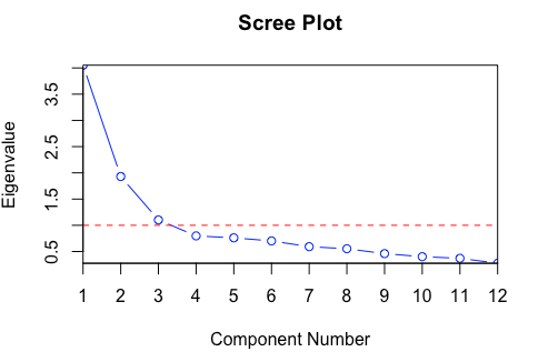
- Construction of a Scree Plot
- Perform PCA: First, PCA is conducted on the dataset, which involves calculating the covariance matrix and deriving its eigenvalues and eigenvectors. The eigenvalues represent the variance of each corresponding eigenvector (principal component) captured.
- Sort Eigenvalues: The eigenvalues are sorted in descending order. Each eigenvalue corresponds to a principal component, with the largest eigenvalue representing the principal component that captures the most variance.
- Plot the Eigenvalues: The sorted eigenvalues are plotted against their rank (the order of the principal components). Typically, the x-axis represents the principal components ordered from the first to the last, and the y-axis represents the magnitude of the corresponding eigenvalues.
- Interpreting the Scree Plot
- Elbow Method: The key to interpreting the scree plot lies in identifying the “elbow point,” which is the point at which the slope of the curve dramatically changes. This point signifies that each subsequent principal component contributes significantly less to explaining the variance. The components before the elbow point are sufficient to describe the dataset effectively.
- Variance Explained: The scree plot often includes a line or a secondary y-axis showing the cumulative percentage of the variance explained by the principal components. This helps to visually assess how much of the total dataset variance is captured as more components are included.
Leave a comment