
Day60 ML Review - Cross Validation (5)
ROC area Under The Curve (ROC AUC)

(https://developers.google.com/machine-learning/crash-course/classification/roc-and-auc)
Key Concepts
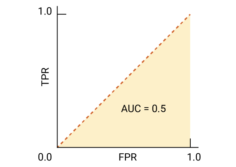
Receiver operating characteristic (ROC) graphs are useful tools for selecting classification models based on their performance in terms of false positive rate (FPR) and true positive rate (TPR). These rates are calculated by adjusting the classifier’s decision threshold. The diagonal line in an ROC graph represents random guessing, and any classification models falling below the diagonal line are considered worse than random guessing.
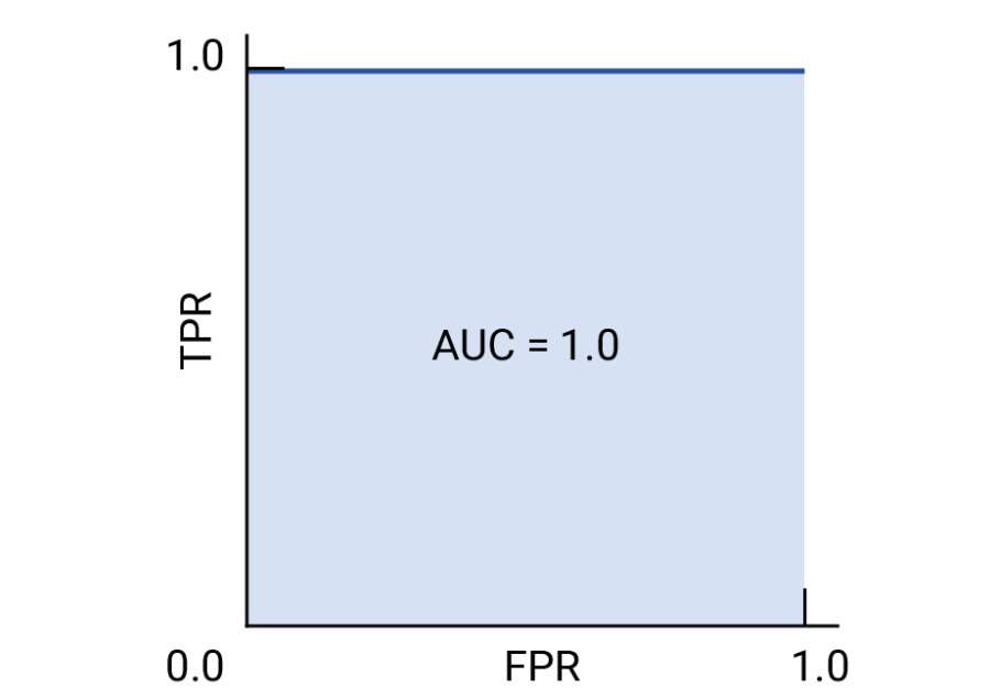
In an ideal scenario, a classifier would be positioned in the top-left corner of the graph, with a True Positive Rate (TPR) of 1 and a False Positive Rate (FPR) of 0, as below.
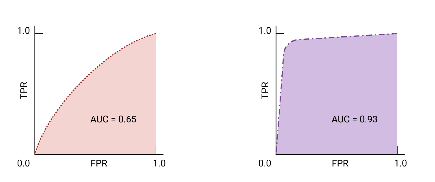
Using the ROC curve, we can calculate the ROC area under the curve (ROC AUC) to evaluate a classification model’s performance.
AUC and ROC for Choosing the Model and Threshold
Area Under the Curve (AUC) is a helpful metric for comparing the performance of two models, provided that the dataset is balanced. When dealing with imbalanced datasets, using the precision-recall curve is better. The model with a larger area under the curve is generally considered better.
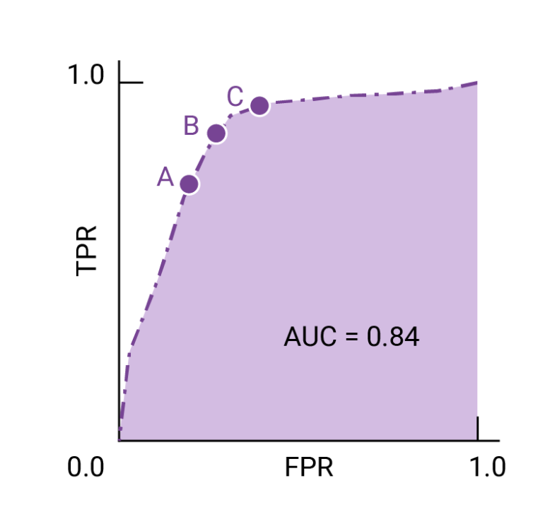
The points on a ROC curve closest to (0,1) indicate a range of the best-performing thresholds for the given model. As explained in the Thresholds, Confusion Matrix, and Choice of Metric and Tradeoffs sections, the choice of threshold depends on which metric is most important for the specific use case. Consider points A, B, and C in the following diagram, each representing a threshold.
Scikit-learn Application
In the upcoming code example, we will generate an ROC curve to evaluate the performance of a classifier that utilizes only two specific features from the Breast Cancer Wisconsin dataset to determine whether a tumor is benign or malignant. Despite using the same logistic regression pipeline as before, this time we will only employ two features. (This decision is made to increase the difficulty of the classification task by withholding valuable information from the other features, resulting in a more challenging ROC curve.) To further enhance the visual interest of the ROC curve, we will reduce the number of folds in the StratifiedKFold validator to three. Below is the code snippet:
from sklearn.metrics import roc_curve, auc
from scipy import interp
pipe_lr = make_pipeline(StandardScaler(), PCA(n_components=2),
                        LogisticRegression(penalty='12',
                                           random_state=1,
                                           solver='lbfgs',
                                           C=100.0)
# use only two features
X_train2 = X_train[:, [4,14]]
cv = list(StratifiedKFold(n_splits=3, random_state=1).split(x_train, y_train))

fig = plt.figure(figsize=(7, 5))
mean_tpr = 0.0
mean_fpt = np.linspace(0, 1, 100)
all_tpr = []

for i, (train, test) in enumerator(cv):
                        probabs = pipe_lr.fit(
                        X_train2[train],
                        Y_train[train].predict_proba(X_train2[test])
                        fpr, tpr, thresholds = roc_curve(y_train[test],
                                                        probas[:, 1],
                                                        pos_label=1)
                        mean_tpr += interp(mean_fpr, fpr, tpr)
                        mean_tpr[0] = 0.0
                        roc_auc = auc(fpr, tpr)
                        plt.plot(fpr,
                                tpr,
                                label='ROC fold'))
plt.plt([0,1],
       [0,1],
       linestyle='--',
       color=(0.6, 0.6, 0.6),
       label='Random guessing')
mean_tpr /= len(cv)
mean_tpr[-1] = 1.0
mean_auc = auc(mean_fpr, mean_tpr)
plt.plt(mean_fpr, mean_tpr, 'k--', label='Mean Roc (area = %0.2f)' % mean_auc, lw=2)
plt.plt([0, 0, 1],
       [0, 1, 1],
       linestyle=':',
       color='black',
       label='Perfect performance')
plt.xlim([-0.05, 1.05])
plt.ylim([-0.05, 1.05])
plt.xlabel('False positive rate')
plt.ylabel('True positive rate')
plt.legend(loc="lower right")
plt.show
In the code example above, we made use of the StratifiedKFold class from scikit-learn to perform cross-validation. Specifically, we employed the roc_curve function from the sklearn.metrics module to assess the receiver operating characteristic (ROC) performance of the LogissticRegression classifier within our pipe_lr pipeline for each iteration of the cross-validation process.
Additionally, we employed the interp function from SciPy to create an average ROC curve from the three folds and then calculated the area under the curve (AUC) using the auc function. The resulting ROC curve revealed variations across the different folds and the average ROC AUC value of 0.76 falls between a perfect score of 1.0 and random guessing.
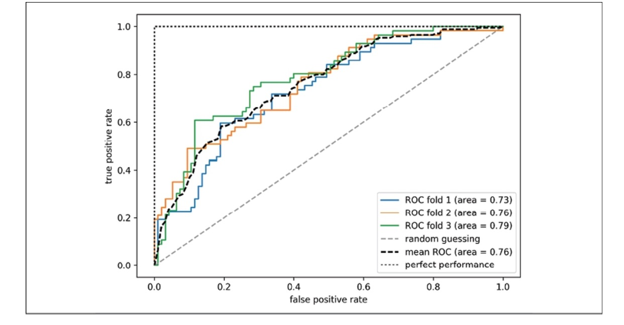
Image from: (S. Raschka and V. Mirjalili, Python Machine Learning: Machine Learning and Deep Learning with Python, scikit-learn, and TensorFlow 2, 3rd ed. Birmingham: Packt Publishing, 2023.)
To determine the ROC AUC score, we can also directly import the roc_auc_score function from the sklearn.metrics submodule, which can be used in a similar manner to other scoring functions, such as precision_score.
Leave a comment